Ranking Every Sharks Jersey Era

While the San Jose Sharks have yet to win a Stanley Cup, the franchise has built a strong history through the eras, with each bringing jerseys that ranged from average to iconic.
Many current fans can personally remember these eras with vivid clarity: the early '90s, with Owen Nolan, Vincent Damphousse, Teemu Selanne, Mike Ricci, Patrick Marleau, Bryan Marchment, and Evgeni Nabokov; the 1993-94 breakthrough, when they made the playoffs for the first time and beat the Detroit Red Wings in a seven-game series; the Nolan/Nabby/Marleau era; the Jumbo Joe/perennial contender era; the recurring post-season heartbreak eras (losing their 3-0 series lead against the L.A. Kings in 2014-15; winning the Western Conference Final and reaching the Stanley Cup Final before losing to the Penguins in 2015-16; the comeback against Vegas in Round 1 and the seven-game Round 2 win against Colorado before losing to the Blues in 2018-19); and the GM transition and rebuilding eras. All of these bring us to the present and to the future is teal era.
Nestled within this history are the (mostly) black and teal jerseys that have helped define the franchise's visual identity. With that history in mind, here's how the Sharks' jersey eras stack up.
#4 — Approaching Middle of the Pack
Starting off with the 2007-13 jerseys, but the black alternate jersey specifically, this jersey features a few design elements that slot it into the lower rankings. While the classic black base and lack of orange in the striping gives this jersey a cleaner appearance than some of the primary jerseys of this era, the alternate, introduced in 2007-08, removes the traditional triangle crest that frames the shark. It also features two of the same patches on both shoulders: the letters SJ with a shark fin in a diamond on the lower right. The tie-string neckline also feels out of place next to the modern design elements and colors.
The 2013-17 jerseys also fall into the bottom ranking, again featuring that vintage tie-string neckline. These ones are redesigned for performance, incorporating the Reebok fabric and taking away the shoulder caps from the previous era to make the sweater lighter.
Next up, the 2022-23 Reverse Retro had a great concept, paying homage to the Oakland Seals and an earlier part of Bay Area hockey history. These sweaters feature a very modern and casual script that reads, "Sharks" across the front of the jersey, and then a lot of negative space, no graphics. Sleeve striping is placed directly at the shoulder seams, cuffs, and hemline. If the franchise were to revisit this design, it could be fun to go all in on the vintage homage and get out the white skates, too.
Finally, the 2015 Stadium Series jersey has a wide horizontal striping, but one detail that does stand out positively are the NorCal fin arm patches. Since this game was against the Los Angeles Kings, the added detail and pride for Northern California hockey is a nice touch.
#3 — Strong Contender
Outside of the black alternate mentioned earlier, the 2007-13 era of jerseys brought a noticeably more modern look to Team Teal. With the Reebok EDGE uniform system, a more saturated teal color, and an updated shark-chomp crest, the teal home sweater and white road sweaters were a significant visual evolution for the franchise.
#2 — Runner-Ups: 2015-16 and 2020-21
It would be a challenge to go wrong when the source material used is already so iconic. The Sharks' Heritage jerseys brought back everything distinctive about the original era, including the classic shark crest, teal color scheme, and traditional striping. The wide grey striping was clean, while still keeping the original design from decades ago strong.
#1 — Best Era (Tie)
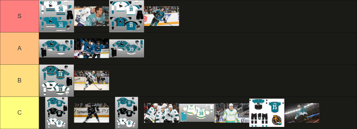
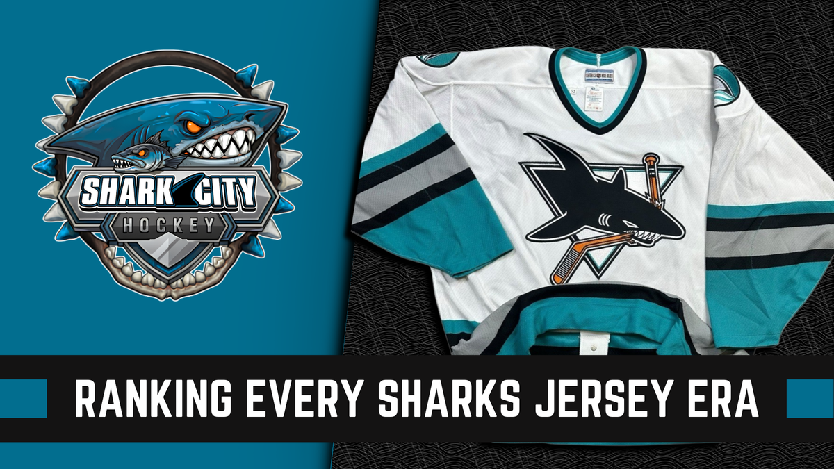
The original Sharks uniform from 1991-98 is iconic for a reason: the shark-in-triangle crest, y2k lighter teal, grey shark fin shoulder patches, and the three-color five-block striping at the hem. Everything about it comes together to create one of the NHL's most recognizable identities. To have an immediate look that felt unique as a brand-new franchise must have been a cool part of their identity during this era.
Ultimately, the 1998 redesign, (used until 2007), gave the franchise just enough modernity while retaining the elements of the original design. Rather than stripping away at the past, the franchise repurposed the alternate from 1997-98, making it the basis for the team's home jersey. The teal home sweater, white road sweater, and black alternate all formed a nice, visually cohesive set.
Both of these uniforms’ eras are unmistakably San Jose, sharing the top spot to round out the rankings of the Sharks’ franchise history.